
Exaggeration with Maps
All maps distort whatever data they try to present. The examples below show, in increasing levels of magnitude, how badly this exaggeration can accumulate with scale. These examples aren’t being used for propaganda purposes, but illustrate how similar representations could be used in such a way.
Take this example from a recent article on foreclosures in the Chicago area:
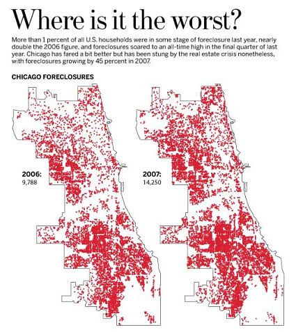
Each red square represents a single property under foreclosure. The problem is that distortion of scale presents the problem as being much worse than it may be. At the scale of the of the image above (approximately 13 pixels per mile) each red marker represents a square of approximately 400 feet on a side. It’s enough to make it appear that the entire city about to go bankrupt. That sea of red certainly elicits a sense of an emergency.
Satellite imagery from the MODIS (Moderate-resolution Imaging Spectroradiometer) Rapid Response Project which shows near real time heat anomalies (most often associated with fires), has been used to raise awareness of slash and burn deforestation techniques.
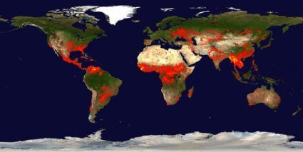
Image courtesy of MODIS Rapid Response Project at NASA/GSFC
At this scale though each pixel represents around 1000 square miles. Looking at the image its not hard to imagine that the entire world is aflame.
Perhaps most exaggerated of all though has to be the images that are typically given to show the accumulation of “space junk“—remnants of space flights and defunct satellites, etc.
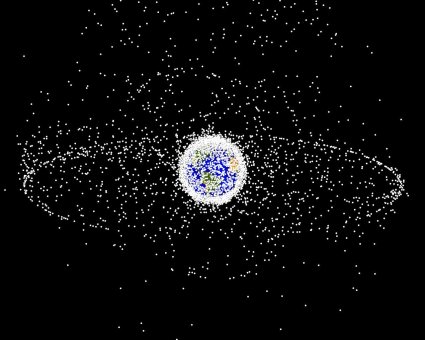
In this image each pixel represents approximately 114 miles; so a piece of debris the size of a car is marked with a point the size of Long Island - easily a 6 order of magnitude exaggeration.
“The Map is not the Territory.”

An object in orbit sweeps out an enormous volume over its lifetime, even in geosynchrous orbit. If anything, that picture under-represents the problem. 80% of safely non-intersecting geosynchronous orbits are already in use, for example. Because of orbital dynamics, there is far, far less real estate in space than on Earth. I’m not sure of the best way to represent that, but I think the picture above is a good try.
» Posted by Anonymous on April 6, 2008 05:39 PM