escutcheon

Twitter Statistics with Yahoo Pipes and the Google Chart API

Below is a segment from a scatter plot generated using a specific Twitter user’s “tweet” data, gathered via Yahoo Pipes and rendered using the Google Chart API.

tweet scatter plot

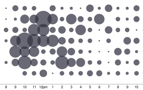
Scatter plot of Tweets - Tweets by Hour and Day of Week

The most interesting aspect of this project is that, other than the static files being served up by xefer.com itself, no other server-side processing is being done here; all the processing is being handled by Yahoo Pipes and Google, and of course Twitter itself which is ultimately hosting the raw data.

Twitter Id:

The initial gathering of data is pretty slow, but subsequent runs are faster because of Yahoo’s caching of the generated output.

The client-side javascript processing the raw data for Google Charts is here.

Update: times should now be displayed in local time, not GMT. Thanks Andy for pointing out the issue.

» Posted: Thursday, May 1, 2008 | Comments (75) | Permanent Link
fleuron

Comments

This is awesome. One thing, the times used seem to be in GMT. (I don’t think I ever tweet at 6 am, much less 27 times).

» Posted by Andy on May 2, 2008 04:54 PM

Argh! You’re right… I’ll see what I can do to fix this up. The whole goal of this project was to do as little processing as possible, but that’s something that should be addressed.

» Posted by winter on May 2, 2008 09:42 PM

Seems like the site can’t find my tweets, even though they’re public. Same goes for other users I’ve tried, such as kevinrose.

» Posted by slonkak on May 6, 2008 10:57 AM

I’ve seen occasional failures from the Twitter side (i.e., 500 Server Errors) which are not currently being bubbled up. FWIW these worked when I tried them just now:

http://xefer.com/twitter/slonkak
http://xefer.com/twitter/kevinrose

» Posted by winter on May 6, 2008 11:11 AM

This is awesome, I like!!

» Posted by joe on May 6, 2008 11:18 AM

That’s cool !! There’s some great potential here…

» Posted by Tim on May 6, 2008 12:25 PM

Interesting site. One comment though, the list of people that you’ve twittered to should only show each person once. But it’s classifying them based on the case that they were entered.

eg. Griffmiester is different to griffmiester is different to gRIFFMIESTER, etc.

Can you fix this?

Thanks,
griffmiester

» Posted by griffmiester on May 6, 2008 12:39 PM

Yes, that’s simple enough to do. I won’t be able to get to it until a bit later on today though. I will try to ping you when this is ready.

» Posted by winter on May 6, 2008 12:45 PM

Why is it case-sensitive? IDisposable fails, but idisposable works.

» Posted by Marc Brooks on May 6, 2008 04:36 PM

It shouldn’t be case-sensitive. I’ve occasionally seen Pipes return empty data structures, but then return the correct ones upon refresh. I’m not sure what to say other than that Pipes is still technically in Beta. At any rate, both these links now return identical charts as they should:

http://xefer.com/twitter/IDisposable
http://xefer.com/twitter/idisposable

» Posted by winter on May 6, 2008 04:57 PM

Very nice ! And very interesting. I am psychologist and i study the interactions which occur in theses worlds. It would be helpfull for me to calculate two or three things (in and outdegree etc). But for that i need to access to the rough data. Does it will cost you a lot a work to add this option. Guess format would be nice. Or CSV :-)

» Posted by Yann Leroux on May 8, 2008 03:33 AM

I use this quite regularly and couldn’t keep sending you a word of appreciation.

Great Work. Thanks.

» Posted by Aravind on June 19, 2008 11:14 AM

Very nice.

To make the display even more information dense and correlated, you might try placing the day-of-the-week histogram (rotated 90 degrees clockwise and flipped) on the right-hand axis of the scatter plot, and the hour-of-the-day histogram at the top of the scatter plot. (Both histograms would need be stretched to align the ticks. When arrranged this way, the histogram bars should probably be less that 100% black, so as not to compete too strongly with the scatter bubbles.)

[I can send you a crude cut ‘n’ paste GIF of what I’m blathering about.]

Cheers,

Tim Black
Software Designer,
Axonwave Software

» Posted by Tim B. on June 25, 2008 12:49 PM

Tim, I had actually toyed with doing just that, but set it aside. I’d like to ultimately produce a single image (even if it’s composed of a number of independent PNG sources) that captures everything the four independent images capture.

Something in the spirit of Minard’s chart made famous by Tufte. :)

» Posted by winter on June 25, 2008 03:06 PM

I put the image here:
http://www.flickr.com/photos/causticsurface/2611526356/sizes/o/


—Tim B.

» Posted by Tim B. on June 25, 2008 04:00 PM

Nice. I’ll see if I can’t make this work.

» Posted by winter on June 25, 2008 04:13 PM

Hello. Just found this site today, nice work! 8-)

Fwiw, Twitter now lets people browse through 160 pages of archived status updates for a total of 3200 tweets.

See http://getsatisfaction.com/twitter/topics/pagination_timeline_and_archive_fixes for details

» Posted by mdy on September 7, 2008 07:11 PM

mdy

Thanks for the update. While the personal archives aren’t publicly available, they have at least upped the available number of tweets to 800 from 200, so I adjusted the application.

» Posted by winter on September 8, 2008 06:52 PM

When you say times are local, do you mean local to the twitter ID, or local to the user viewing the charts? Might be useful to put the timecode somewhere.

Very cool nonetheless …

» Posted by Mike on September 17, 2008 11:36 AM

The time is local to the user viewing the charts; i.e., the local time of the machine actually viewing the data. I’ll see about dropping in a note somewhere to that effect.

» Posted by winter on September 17, 2008 01:04 PM

Beautiful idea, beautiful graph but I’m desesperate because it doesn’t seem to work or it’s very,very, very slow. I’ve tried with “HugePierre”, “hugepierre” or “http://xefer.com/twitter/HugePierre” and nothing seem to happen. Could you please give an idea of the time it takes for N tweets? In case the problem is a “natural” slowness problem, it could be useful to have on the page an indicator of activity like a progress bar or some sort of blinking LED. Any way thank you for the little instant of dream when discovering your site.
Regards
PH

» Posted by Pierre on October 8, 2008 08:48 PM

Pierre,

There is a progress bar and “pulser” image that appears as it is downloading the tweet data.
Occasionally there is a service interruption on the Twitter side which appears to have been the case when you tried it. Yahoo Pipes doesn’t distinguish between a service interruption and no data. At any rate, things seem to be working now:

http://xefer.com/twitter/HugePierre

loads when I tried it in ~10 seconds.

» Posted by winter on October 9, 2008 08:14 AM

Awesome!

» Posted by Vadimas on October 10, 2008 11:18 AM

What is the list of names way at the bottom after each search with the numbers after them?

» Posted by Sam Freedom on October 25, 2008 07:23 PM

Very cool way to visualise your tweets. well done.

» Posted by Leon Poole on October 26, 2008 07:49 PM

This is fantastic. Beats Tweetstats etc on levels of geekyness / coolness.

http://xefer.com/twitter/litmanlive

» Posted by Michael Litman on October 27, 2008 07:24 AM

I second Sam Freedom’s question:
What are the numbers in brackets next to the list of names under the graph?

» Posted by Dave on October 27, 2008 09:23 AM

>> What are the numbers in brackets next to the list of names under the graph?

The names are users you have sent a reply too, and the number in the parentheses are the number of times you have replied to that users.

I’ll admit, this part of the interface is still rather inchoate, but I wanted to at least put something out there that allowed a user to follow links to the charts of other users they have some sort of relationship with.

» Posted by winter on October 27, 2008 09:59 AM

Hi! I’d love to try it, but everytime I return to the site and enter my name, I get the same response. It pulls the number of my tweets, but then there’s just a spinning circle on the graph and the browser says “done with errors on page”

Am I doing something wrong?

My tweets are public, and I’ve made sure to match the case

» Posted by Elleasea on November 3, 2008 08:18 PM

Elleasea,

Yahoo Pipes was having some sort of DNS problem according to their page, so it was down most of the morning. Things seem to be back to normal now:

http://xefer.com/twitter/Elleasea

» Posted by winter on November 4, 2008 07:57 AM

Yay! Thanks for doing this. I’ve been wanting this kind of data for a while, and was thinking someone had to have had the same thought already. Just found this today, and it’s great.

» Posted by Scott Palmer on November 17, 2008 04:09 PM

Heya :) Very creative! It’d be cool to see this graph set side by side with the twitter gadget on something like iGoogle. and I mean that in the most unbiased way possible (;

» Posted by caffleine on November 23, 2008 07:17 PM

Very nice graph, thanks for sharing !
I am still puzzled to how the actual data are populating the chart, could you give a hint ?
I looked at the source code which only seems to set up the skeleton plot. Where do you import the data and how do you pass them to the chart ?

Thanks !!

Mark

» Posted by Mark on November 28, 2008 11:41 PM

There’s no real secret. It uses the standard JSONP callback technique supported by Yahoo Pipes to return tweet data.

Yahoo Pipes returns all data as either RSS or JSON. In this case it’s easier to parse JSON data so I return it that way. The callback function iterates through the tweet data populating the data structures.

» Posted by winter on November 30, 2008 02:31 PM

Is there a way to limit it to, say, the last 30 days?

I love it as-is, BTW.

» Posted by hpb on December 11, 2008 05:02 PM

>> Is there a way to limit it to, say, the last 30 days?

Not currently.

I’ve considered adding some sort of slider to the graph - similar to what, for example, Google Finance, has for showing stock data. It would be relatively straight-forward. First though I’d like to try to wire the Pipe into some mechanism to cache the data. Yahoo Pipes does have caching but it clears it out after a hour or so.

» Posted by winter on December 12, 2008 12:59 PM

very very very cool.

can’t wait to see more! plenty of ideas spring to mind! :-)

» Posted by Stefan on February 24, 2009 06:46 PM

handy little tool, thankyou

Like Mark “Where do you import the data and how do you pass them to the chart ?” I’d love a little more information as to how this is put together.

Thanks

» Posted by coulson on March 1, 2009 12:38 PM

Very nice graph,good idea.

» Posted by Team07 on March 13, 2009 05:20 AM

Very cool, could it show my data and my friends data overlayed to compare?

» Posted by Matt on March 17, 2009 05:31 PM

I can’t seem to load anyone but guy kawasaki’s tweets…but the idea is awesome, what is the software?

» Posted by annitot on March 25, 2009 05:03 PM

I’m not sure why, but this doesn’t seem to be working recently. I tried it last night and again this morning.

Is it user error or something on your side?

» Posted by Chuck Tanowitz on April 16, 2009 11:50 AM

Not displaying data.

» Posted by Anonymous on May 4, 2009 09:45 AM

My twitter username is seanr1978. It says it loaded my tweets (524 of them), but the graph never gets drawn. This is a great idea, but it’d be far better if it actually worked. ;-)

» Posted by Sean Robertson on May 4, 2009 09:52 AM

Unfortunately, Yahoo has temporarily cut off the underlying Pipe. It should be back online in a little while, so try again later.

» Posted by winter on May 4, 2009 10:17 AM

awesome! i see that i’m loud and clear at 2pm LOL.

» Posted by etta on May 7, 2009 12:16 AM

Beautiful and very interesting!

Tongue-in-cheek proposal : add login protection, using twitter credential, and limit to regular tweeterers. As a way to avoid your boss handing you a print-out of your working-time twitting activity stats ;)

» Posted by sja on May 20, 2009 10:44 AM

This is really nice… mind if i save the graphic?

» Posted by Bruno on June 15, 2009 12:15 PM

Its Just awesome!!! I salute the development team… Keep it up!!

» Posted by Saikat Sinha on June 18, 2009 11:50 AM

Can you add a legend and explanation of what I’m seeing?

» Posted by Rick on June 24, 2009 03:18 PM

I love this. Used it the other day. For some reason, it looks like it isn’t working right now. Do you know if this is temporary? Was hoping to use a screen grab for a discovery project. Thanks!

» Posted by Ryan on August 6, 2009 04:12 PM

It looks to be some problem on the Yahoo Pipes side. I can only guess that it has something to do with the DDoS attack that Twitter suffered today. I

» Posted by Winter on August 6, 2009 06:46 PM

Love it.

» Posted by joan ellen on December 10, 2009 04:15 PM

Love this tool! So useful. I would like to talk about it as part of an upcoming blog on really useful Twitter tools you may not have heard of and would love some background on how you came up with it and any sense you might have of different ways folks are using it. Thanks - Mike Johansson, mikej@fixitology.com

» Posted by Mike Johansson on January 1, 2010 10:06 AM

I have tried all day and have not been able to get all the results, the progress bar makes it about 3/4 of the way and stops—several attempts. have tried others accts and they completely load, but neither has had the conversations available, only a number of empty boxes. looking forward to being able to see & use the entire program

Thank you

» Posted by Gary on January 6, 2010 02:16 AM

This is great! I would love to be able to see this chart populated with my whole twitter feed of the people I follow, or even a specific list, instead of a single user. Would that be too much data to crunch?

» Posted by trikno on February 3, 2010 06:34 PM

i like what you did. would you mind sharing the code for how you did the chart part? i’m especially interested in how you drew the concentric circles.

thanks.

craig

» Posted by craig on June 21, 2010 01:29 PM

Nice tool with a very good Yahoo-Pipe-implementation. http://www.xefer.com/twitter/waren_mueritz

» Posted by Sven Mueritz on August 29, 2010 08:06 AM

Excelent project! Thank you very much.
What exactly is the number at the bottom in the right hand? It is like a summary? an average? Thank you!

» Posted by fsilvab on September 20, 2010 04:57 PM

What a cool application

» Posted by Henrik Flensborg on October 13, 2010 03:40 PM

Great tool! But what does the bubble in the bottom right corner show? It would be nice to have a bubble with totals or average (per week etc.)

Cheers,
David

» Posted by David on November 24, 2010 09:57 AM

Hi, I think this is an awesomely useful tool. However, sometimes when I try to use it, and on certain twitter IDs, it doesn’t work. These are on completely open IDs, not private so it can’t be that. (It doesn’t work on my own, for instance). Is there a bug that could potentially be fixed in this? Thanks!

» Posted by Karl on April 13, 2011 03:17 PM

If you could give me some of the ids that aren’t working I could check it out. The app is definitely flaky at times in that Pipes and Twitter can sometimes fail, timeout or block for other reasons (because of flood detection, etc.)

As mentioned in the text, the whole thing is implemented as client-side java script (using no server-side xefer.com resources was part of what I wanted to try and do as part of the project).

That being said, I have seen bugs in the regex parsing of some of the tweet data. So if the data is incorrectly parsed it might halt loading and it just hangs. I’ve fixed most of those conditions but I’m sure more will emerge.

» Posted by winter on April 14, 2011 01:52 PM

Great Job Guy!!

Whould be great if it can also be used to track #HashTags…

» Posted by Rafael Reinoldes on April 22, 2011 11:36 AM

I stoped working after two or three times.

» Posted by Arturo on April 30, 2011 01:11 PM

This is fantastic!

I wanted to let you know, some of my colleagues and I are using this as a research tool to gather some data for an article we are writing concerning the use of twitter by fraternity and sorority advisers and students.

This is a fantastic way to compare twitter accounts to see if the times when they are most active match up!

» Posted by Chris on June 22, 2011 10:25 AM

I am glad to find this tool. This is amazing.
I observe that the retweet count shown on the graph for twitter handles is very low. Is this overall count till date or only for a day/hour? Will be helpful if you can mention what does the Retweet and rely refer to?

» Posted by Robert on June 22, 2011 01:05 PM

@Robert: All the statistics are of tweets made by the given user. So a “retweet” is when the given user retweets some other user’s tweet using the retweet functionality of Twitter. Reply is when the given user has replied to some other user’s tweet.

The numbers in the lower right hand corner refer to the number of that type (tweet, retweet, reply) that a circle of that size represents. The largest circle is always of the same diameter, but represents a different number of tweets for any given user. People generally retweet and reply less than they actually tweet, so generally those colored circles are of a correspondingly smaller diameter.

Perhaps the easiest way to get a feel for what the numbers represent is to slide the right-hand slider handle all the way to the left so that only a single tweet is shown. Then click the right-arrow key one at a time. You will basically see the tweets getting added to the graph one at a time and can watch how the circles change depending on the relative numbers.

» Posted by Jeffrey Winter on June 22, 2011 02:48 PM

Didn’t this tool used to be able to give the top people that a user @replies to? I seem to recall that. Now it no longer loads under the main charts. Did that feature get removed? I really liked it. I can’t find any other sites that give that data.

» Posted by mattmaldre on September 12, 2011 12:38 PM

Great tool really love it. Seems like it has a malfunction with account that have a lot of tweets.

» Posted by James Hart @ Key Multimedia on November 24, 2011 04:55 AM

Loving your product! Quick question about time. When you say times are local does that mean that if a friend who posts in NYC at 3amEST will be viewed by me in the UK as being posted at 8amGMT (+5hrs)? Using your tool for some research and need to be sure of what the time actually represents. Thanks again!

» Posted by bob on December 20, 2011 02:27 PM

Xefer stopped working one week ago, anyone know why and how?

Thks

» Posted by Antoine on March 15, 2012 02:41 PM

I’ve just tried your service. Totally tweets shows, but no graph. Why? Can this be fixed? I tried in Explorer and Chrome using a P.C. I’ll try my Mac later.
Cheers,
Michael

» Posted by Michael Stout on April 25, 2012 10:51 PM

If de user has >100.000 twits only show from 100.001???

» Posted by Thanks on December 13, 2012 04:06 PM